Website Design & Development
A lead-generation landing page for an independent takaful agent, designed in Figma and built as a small static site where every path ends in WhatsApp.
- Role
- Design & development
- Year
- 2026
- Type
- Concept project
- Deliverables
- Figma design · Spec sheet · Landing page
- Stack
- Figma · Vite · Tailwind CSS v4 · TypeScript · Netlify · Claude Code
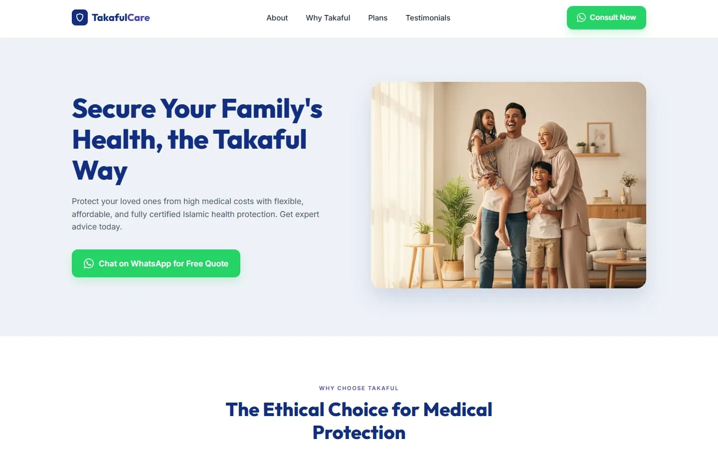
A takaful agent doesn’t sell on a checkout page. People buy after a conversation with someone they trust. So this page has one job: get a worried parent to open a WhatsApp chat with the agent.
Trust first, then a chat.
Most licensed takaful agents in Malaysia work alone. Their leads come from referrals and WhatsApp, and their “website” is often a social media profile or a PDF brochure. I wanted to show what a small, focused landing page could do for one of them.
Ahmad Razif is the fictional agent I designed it for: a senior consultant selling Shariah-compliant medical plans to families. The visitor is usually a parent comparing options after a hospital scare. They need three answers quickly: is this halal, can I afford it, and can I trust this person?
- 1
- conversion path: WhatsApp
- 3
- plans, priced up front
- 6
- sections, one scroll
From reference to Figma.
I started by collecting consultant and advisory landing pages on Dribbble and other design galleries. The good ones put a real person at the centre, show their numbers and credentials early, and keep the page calm instead of salesy.
Insurance pages tend to go the other way, with stock photos of handshakes and walls of fine print. I kept the calm, personal layout and designed the whole page in Figma first, desktop and mobile, before writing any code.
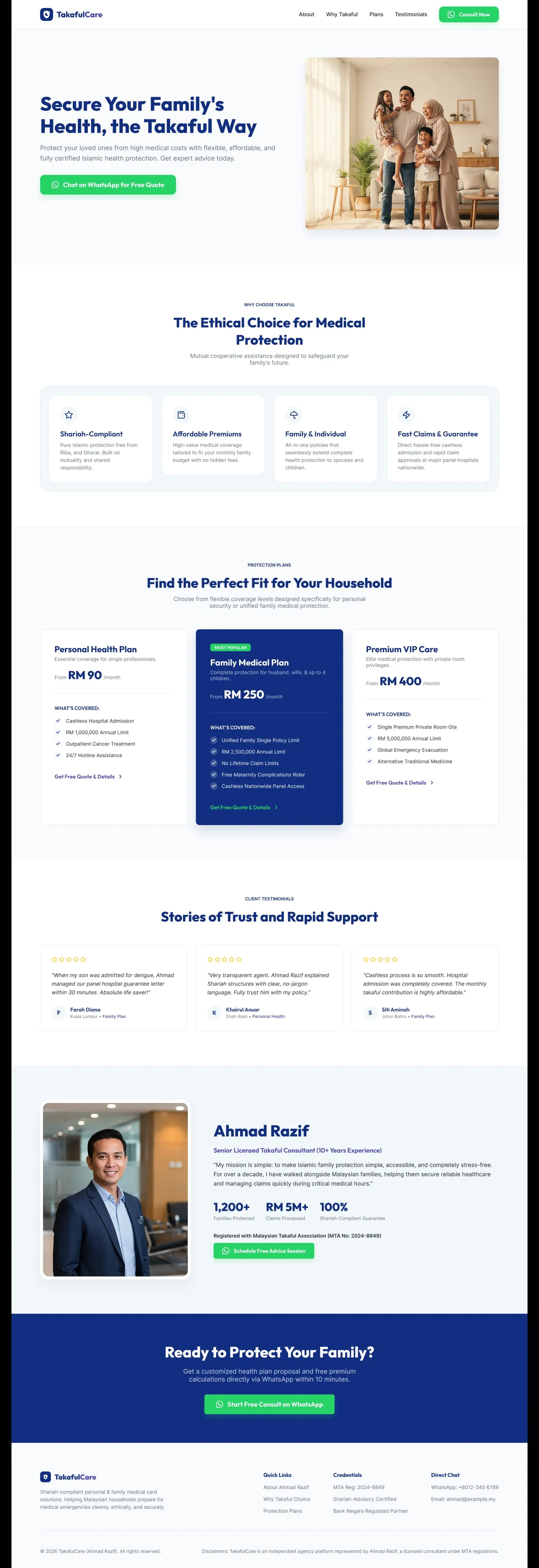
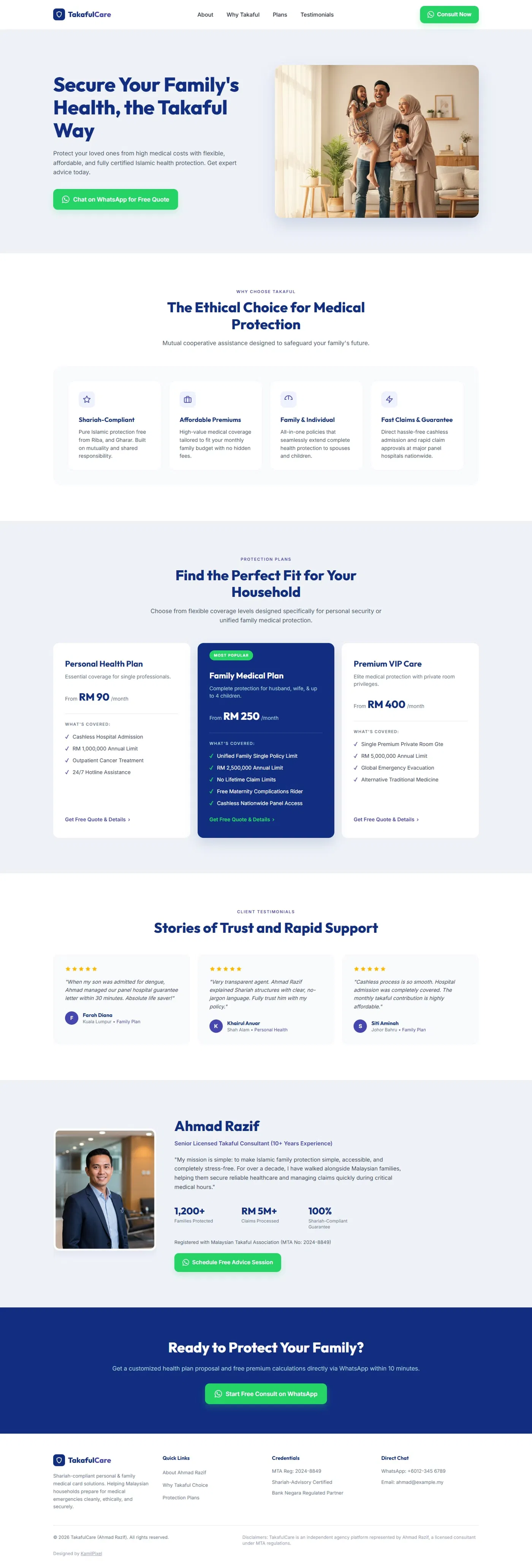
The build follows the Figma file section by section. The main change was giving the hero a soft mist background so it separates from the white feature band.
Navy for trust, green for action.
- Takaful Navy#112E81 · Headings, featured plan
- Care Purple#4647AE · Eyebrows, links
- WhatsApp Green#25D366 · Primary CTA only
- Muted Blue#AACCD6 · Text on navy
- Mist#EEF2F7 · Alternate bands
- Slate 800#1E293B · Body text
Deep navy is the colour of banks and insurers, and here it does the same job: it signals that this is serious and regulated. Purple warms it up for small details like section eyebrows and text links. WhatsApp green is the only bright colour on the page, and it only ever appears on the button that opens a chat.
Outfit at extra-bold gives the headings a friendly, rounded weight, and Inter keeps the plan details and the fine print easy to read.
A spec sheet for handoff
Before building, I turned the Figma file into a one-page developer reference with named colour tokens, the type scale, spacing and radius tokens, button specs and a blueprint for the plan card. Every value in the code traces back to this sheet.
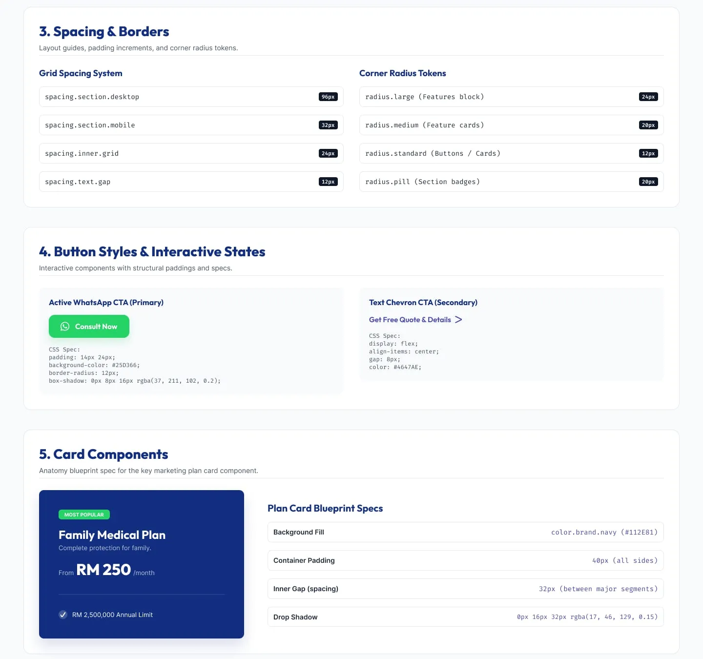
Part of the spec sheet: spacing and radius tokens, the two button styles and the plan card blueprint.
Every section answers a doubt.
The page is ordered around the questions a parent asks. Why takaful at all, what does it cost, has it worked for people like me, and who is this agent? Each section answers one of them and ends near a way to start a chat.
- 01
One green button
The hero, the nav, the agent section and the closing band all use the same green WhatsApp button. Plan cards use a quieter text link, so there is never more than one loud action on screen.
- 02
Prices up front
Each plan shows a “from” monthly price in large type. Hiding prices behind “contact us” is the fastest way to lose a careful buyer.
- 03
A featured middle plan
The family plan sits in the middle in solid navy with a green “Most popular” badge, because that’s the plan most visitors are shopping for.
- 04
Proof before the ask
Testimonials name the city and the plan. The agent section then shows years of experience, families protected, claims processed and a registration number, right above the last button.
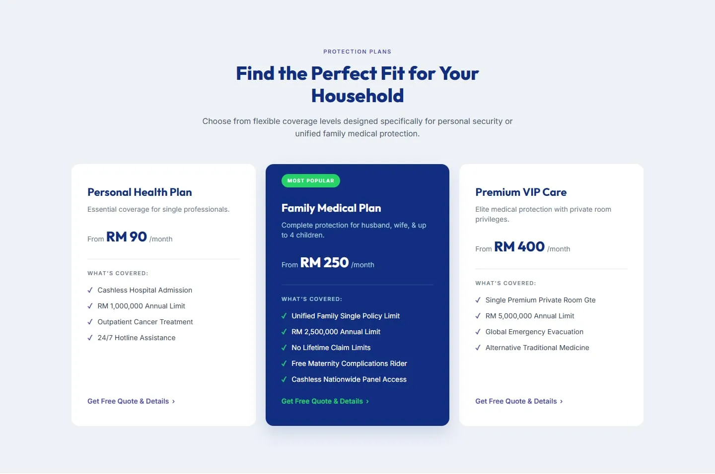
Three plans, with the family plan featured in the middle.
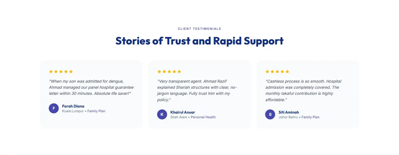
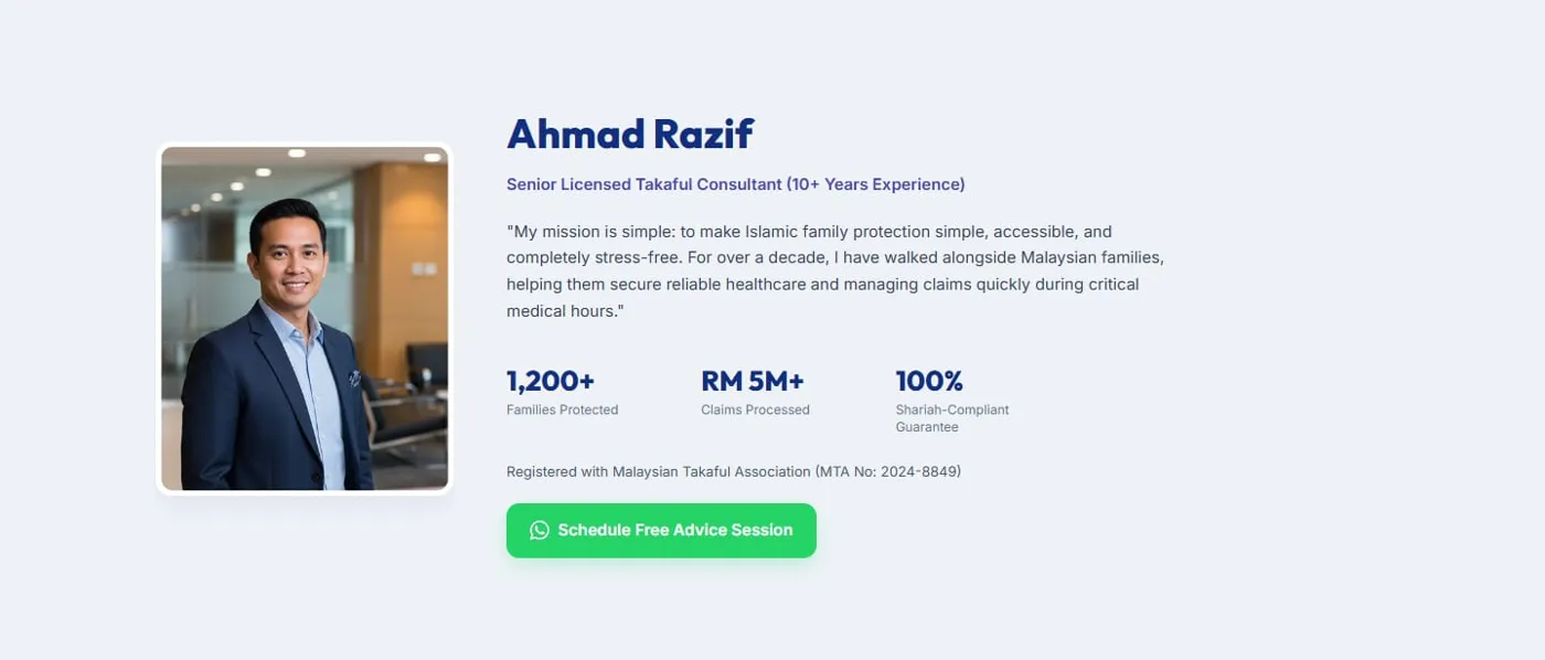
Small enough to load on any phone.
The site is a single index.html, one CSS file and under forty lines of TypeScript, bundled with Vite. It doesn’t need a framework. I used Claude Code to build the markup from the Figma file and the spec sheet, and made the design and layout decisions myself.
- 01
Tokens in one place
The spec sheet’s colours, fonts and shadows live in a Tailwind v4 @theme block, so the markup reads bg-navy, text-purple and shadow-wa instead of raw hex values.
- 02
One icon sprite
The shield, WhatsApp, star and menu icons are SVG symbols defined once at the top of the page and reused with <use>, so the button icon isn’t repeated in every button.
- 03
An accessible menu
The mobile menu updates aria-expanded, closes on Escape and returns focus to the toggle, locks page scroll while open, and closes itself if the window is resized to desktop.
The chat button is always one tap away.
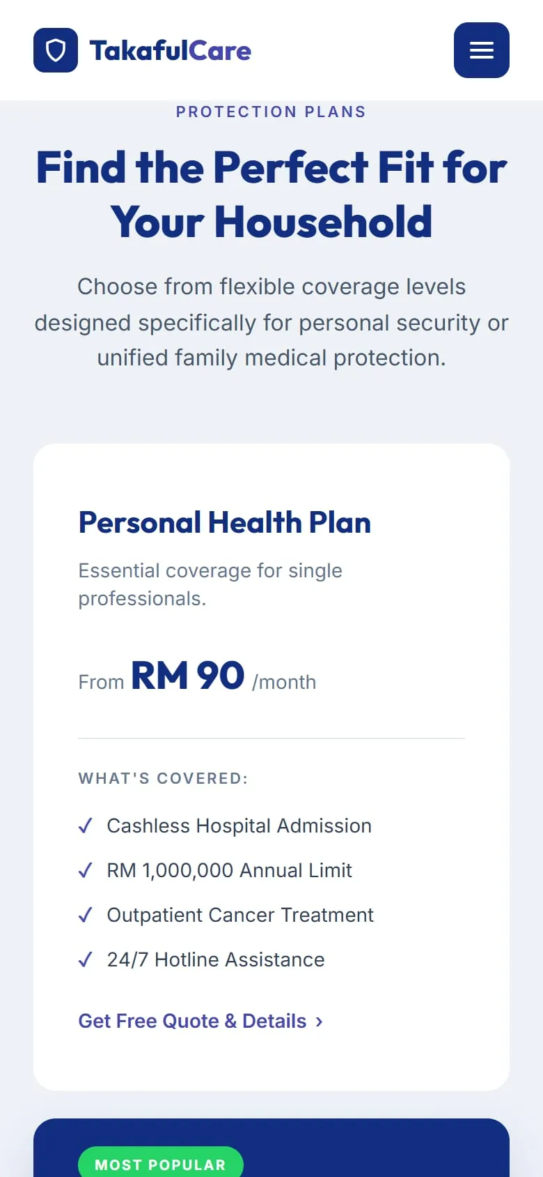
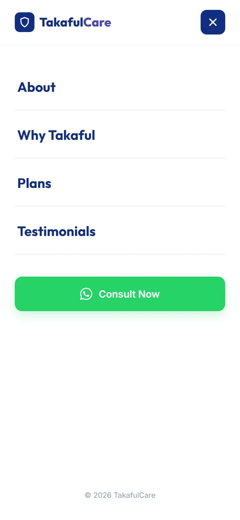
Most visitors arrive from a WhatsApp forward or a social post, so they’re on a phone. On mobile the plan cards stack with the featured plan second, and the menu opens as a full-screen list with a large green Consult Now button at the bottom.
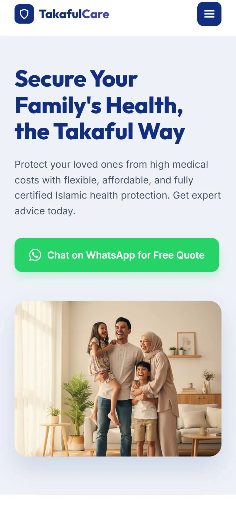
A template for any independent agent.
- 1
- button colour for the only action
- <40
- lines of TypeScript
- 0
- frameworks at runtime
The result is a page an agent could launch in a day. Swap the name, photo, plans and testimonials, and the structure still works, because it’s built around how people buy takaful rather than around one person.
For a real launch I would connect every button to a wa.me link with a prefilled message for each plan, so the agent knows which plan the visitor was reading. I would also add a Bahasa Melayu version, since many families would rather read about their coverage in Malay.