Website Design & Development
A warm, Malay-first landing page for a neighbourhood kopi shop, where every path leads to a WhatsApp chat.
- Role
- Design & development
- Year
- 2026
- Timeline
- 2 days
- Type
- Concept project
- Stack
- Vite · Tailwind CSS v4 · Vanilla JS · Claude Code
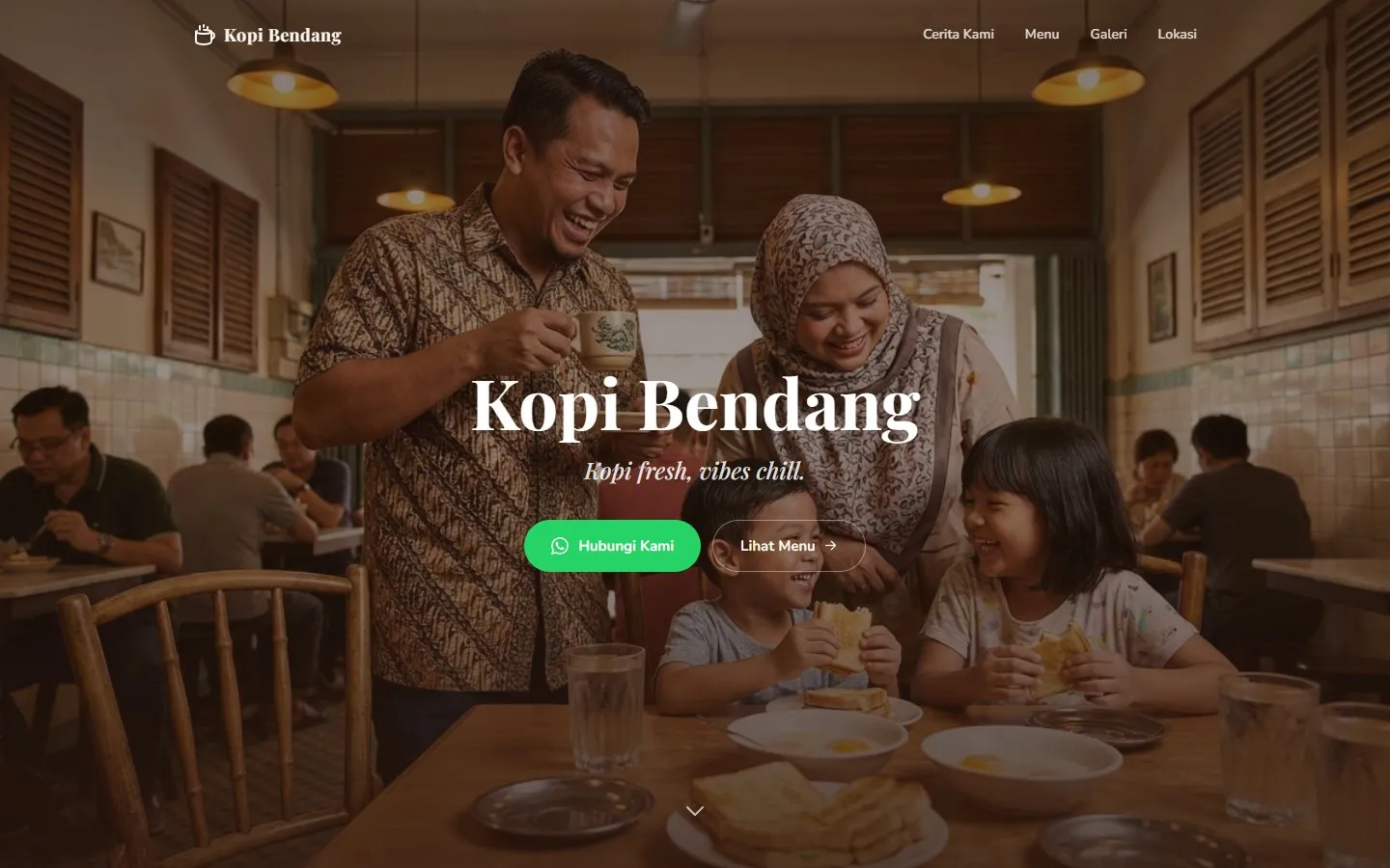
Most coffee-shop templates sell the same Western café. I wanted a page that feels like the kopitiam down the road, and turns a visitor into a WhatsApp message in one tap.
Feel the place, see the menu, send a message.
Kopi Bendang is a fictional neighbourhood kopi shop I created to explore hospitality web design for the Malaysian market. The brief I set myself was a single page that does three jobs quickly: make you feel the atmosphere, show you what’s on the menu, and get you talking to the shop.
Small F&B owners here rarely run booking systems or online stores. Their customers message them. So instead of a cart or a reservation form, every call to action on the page opens WhatsApp. The copy is written in Malay, the way the shop would actually talk to its regulars.
- 1
- page, four sections
- 3
- source files
- 0
- frameworks
Borrow the pattern, make the content local.
I started by collecting coffee-shop landing pages on Dribbble and similar design galleries. Most of them share a pattern that works: a full-bleed, moody photograph, a large serif headline, and a warm earthy palette. The page sells a feeling before it sells a product.
What most of them also share is the same Western café of exposed brick, Edison bulbs and flat whites. A Malaysian kopi shop is a different place: marble tables, kopi in thick-rimmed cups, roti bakar, and whole families at breakfast. I kept the layout pattern and rebuilt everything that carries meaning.
- 01
Kept
Full-bleed hero with a serif headline, a warm cream-and-brown palette, and a simple scroll story: story, menu, gallery, location.
- 02
Changed
Malay-first copy, WhatsApp as the only conversion path instead of “Order online”, and local food and faces instead of stock café interiors.
Cream, roast and a hand-drawn line.
- Cream#F5EDE0 · Page
- Cream light#FAF6F0 · Menu band
- Tan#C9A882 · Rules
- Orange#D4812A · Accent
- Brown text#5C4033 · Headings
- Brown dark#2C1810 · Ink, footer
- WhatsApp#25D366 · Primary CTA
Every colour and font lives as a Tailwind v4 @theme token in one CSS file, so the markup never holds a raw hex value. Apart from the orange accent, the only saturated colour on the page is WhatsApp green, and it is reserved for the one action I want people to take.
The one hand-made detail is a loose, pen-drawn underline beneath each section title. It’s a PNG used as a CSS mask, so it takes its colour from the orange token and scales with the heading.
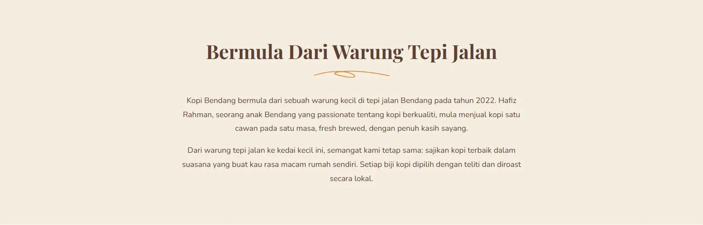
Section title with the masked underline. Colour comes from the token, not the image.
From generic café to Kopi Bendang.
The first build came together in an evening. It worked, but next to the brief it looked like every other café template: a stock Western interior, an orange eyebrow label above every heading, and a name that didn’t mean much.
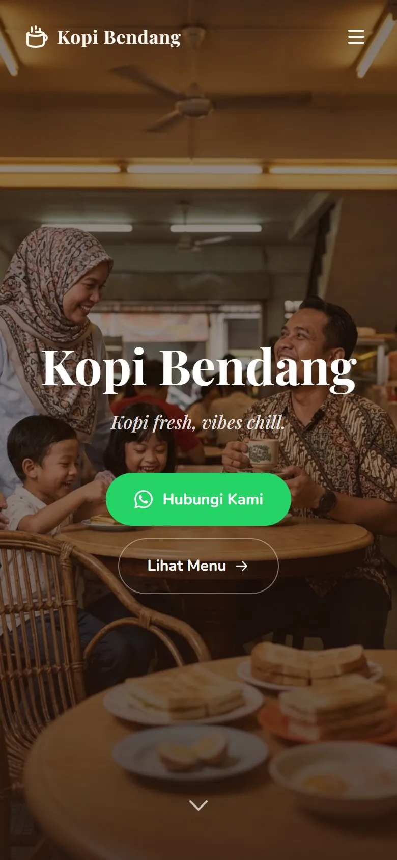
In the second pass I renamed the shop and replaced the hero with a scene that reads as a Malaysian kopitiam: a family sharing kopi and roti bakar. I removed the eyebrow labels and let the underline set the rhythm of the page.
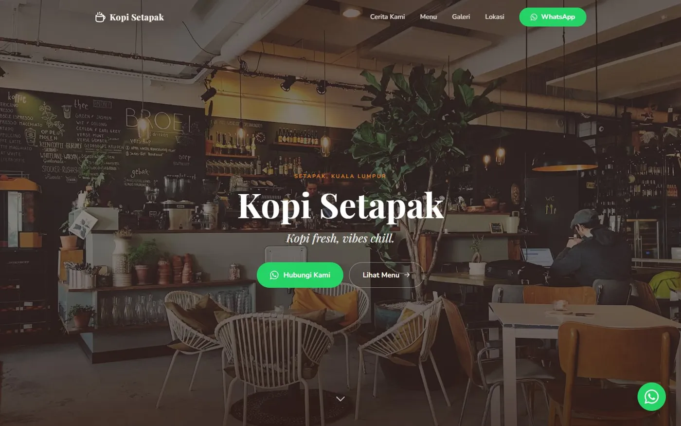
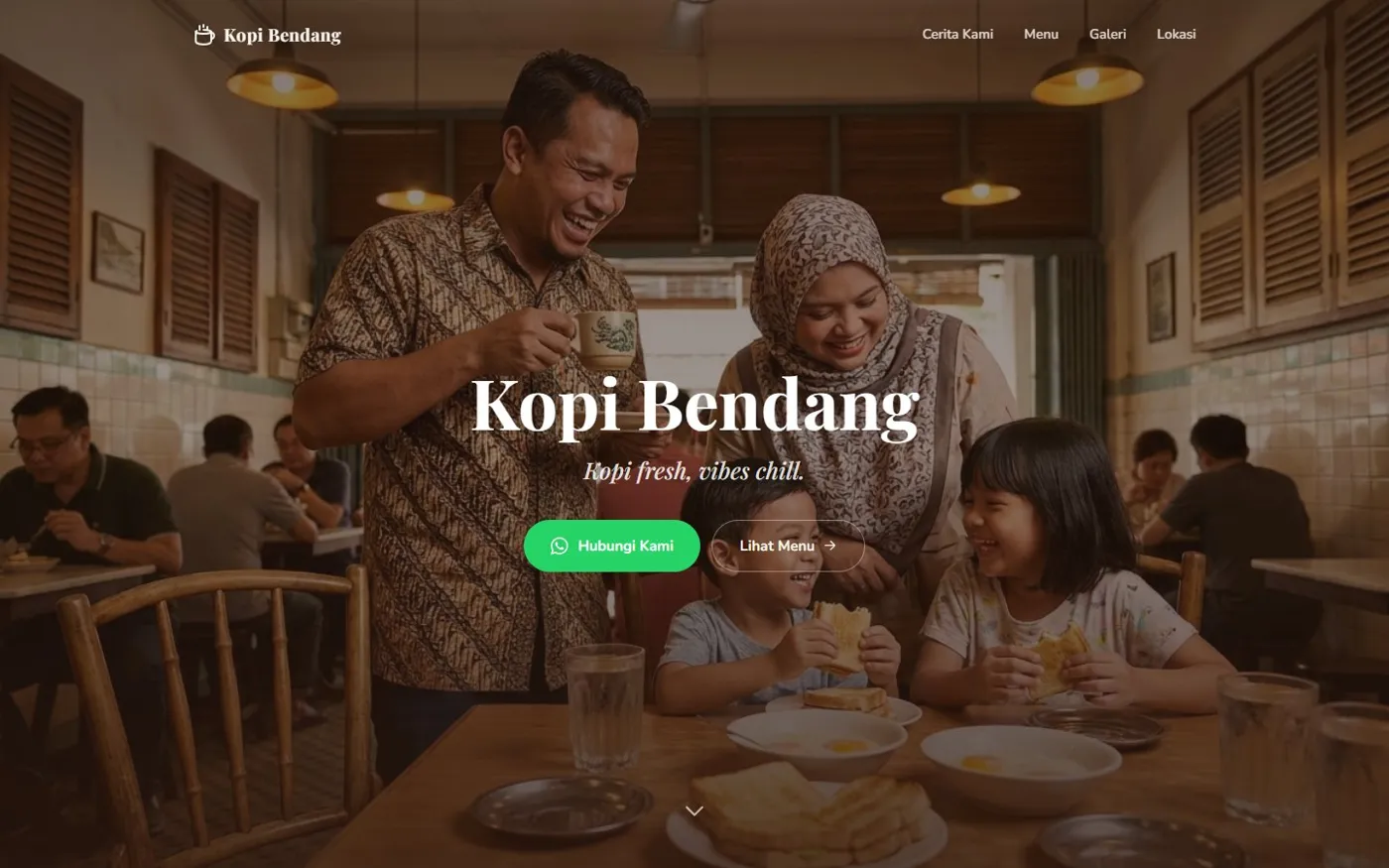
Same layout, different place. The hero now shows who the shop is for.
Art direction for mobile
A centre-cropped landscape photo on a phone usually cuts off the people. So the hero ships two compositions through a <picture> element: a wide one for desktop and a portrait one for phones, each framed so the family stays in shot behind the headline.
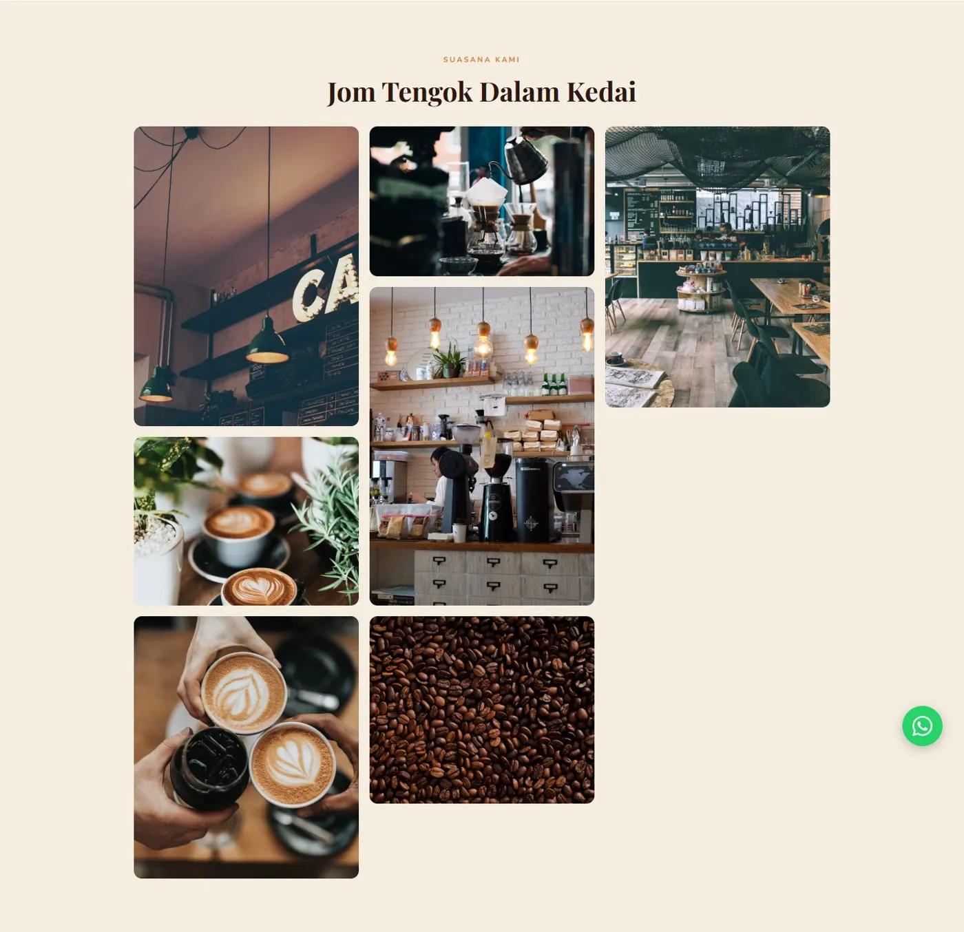
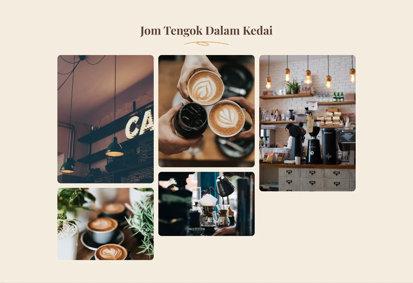
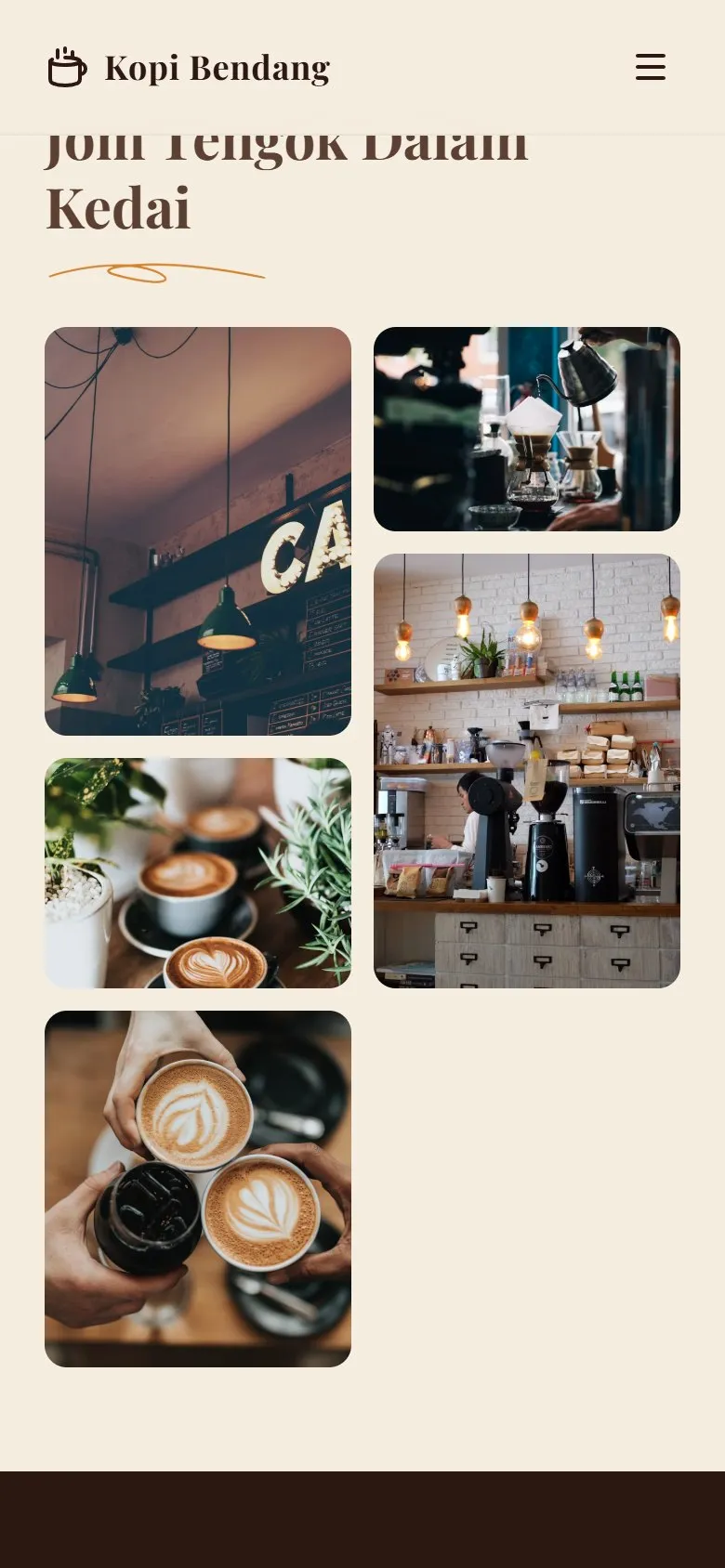
The CSS-columns masonry left the third column far shorter than the rest. Five images with balanced proportions close the gap.
Three files, no framework.
The whole site is one index.html, one CSS file and about seventy lines of JavaScript, bundled with Vite. A static page this size doesn’t need a runtime, and skipping one keeps it fast on a mid-range phone on mobile data. I used Claude Code to speed up the markup and the small interactions, and made the design calls myself.
- 01
A preloader you see once
A branded preloader plays on the first visit only. A tiny inline script in the <head> checks localStorage before first paint, so returning visitors never see it flash.
- 02
A nav that adapts
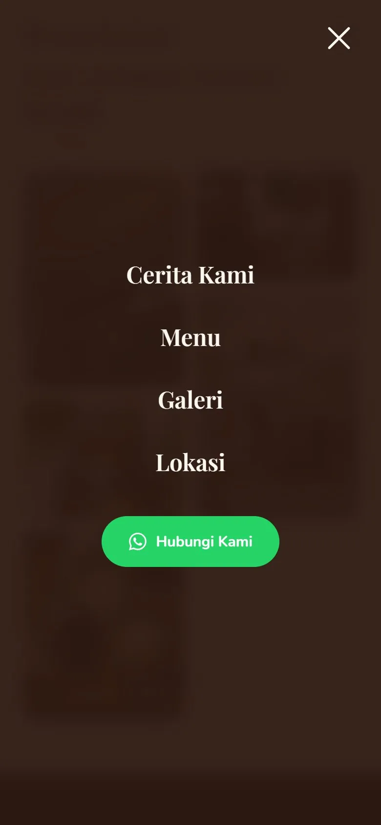
The nav sits transparent over the hero and turns solid cream after 40px of scroll, so it stays readable over the content below.
- 03
A gallery lightbox
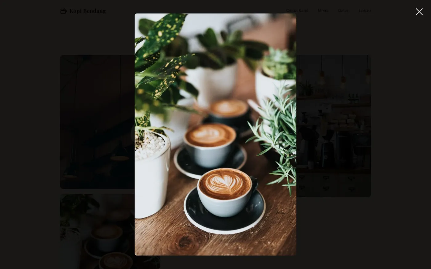
Tapping a photo opens a larger version with a loading spinner. Escape or a tap outside closes it.
- 04
WhatsApp at every step
Primary buttons in the hero and the location section, plus a floating button that follows you down the page.
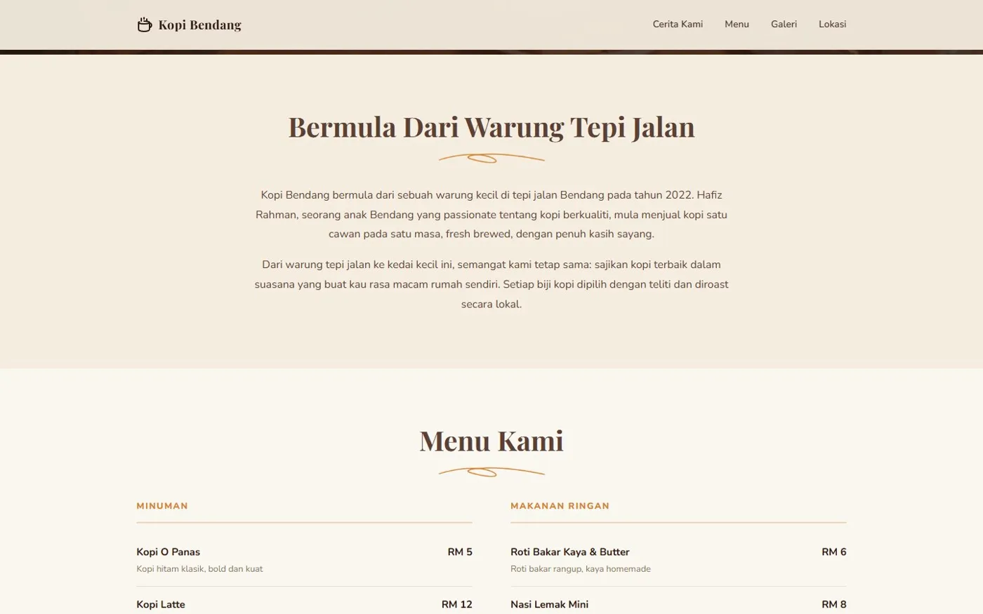
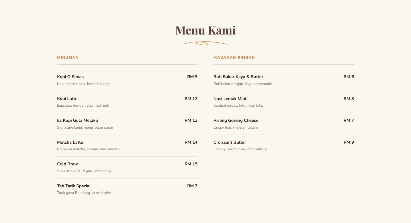
The menu is a simple two-column list, priced in ringgit and easy to scan with a thumb.
Designed for the phone in your hand.
Most people will find a kopi shop on their phone, standing outside or scrolling in a Grab queue. On mobile the headline, the WhatsApp button and the menu are all within the first two swipes.
A template I can hand to a real shop.
- 2
- days, first commit to live
- 1
- conversion path: WhatsApp
- 2
- hero crops, art-directed
Because it is plain HTML with tokenised styles, re-skinning this for a real shop is mostly swapping photos, copy and a handful of colour tokens.
For a real client, the next steps are the shop’s own photography instead of stock images, WhatsApp links with the owner’s number and a pre-filled message, and a Maps embed pointing at the actual address.