Frontend Development
A multi-brand design system on shadcn/ui, and the smart-home portal built on top of it.
- Role
- Design system & frontend
- Year
- 2026
- Type
- Self-initiated concept
- Deliverables
- Tokens · Storybook · Portal
- Stack
- React 19 · TypeScript · shadcn/ui · Radix UI · Tailwind CSS v4 · Style Dictionary · Storybook 10 · Recharts · axe · Cloudflare Pages · Claude Code
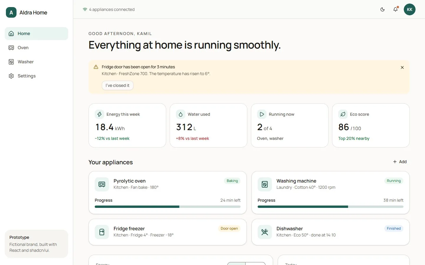
Two brands, light and dark, and a screen as small as an oven panel, all from one component tree. Every build runs 96 contrast checks.
A design system for products you can touch.
I wanted to show how I would build a design system for a company that makes physical products, not only web apps. So I modelled this project on a real enterprise brief for a multi-brand appliance design system, and held myself to the same constraints.
Aldra Home is the fictional group I created to hold it together: a calm Scandinavian flagship brand, Aldra, and a premium dark-metal line, Veyra. Both share one design system and one portal for controlling their appliances.
- 01
Many brands, one codebase
Brands with very different personalities have to share the same components without forking them.
- 02
Light and dark, both accessible
Dark mode is more than a preference: it reduces glare for light-sensitive users. Both modes have to meet WCAG contrast.
- 03
Beyond the browser
The same buttons and dials should work on an 800 × 480 appliance touch panel as well as on a laptop.
- 04
Documented and testable
Every component documented in Storybook, and accessibility checked by tooling rather than by eye.
Same components, different personalities.
- Pine 600#1F5F55 · Primary
- Pine 300#6FB0A0 · Primary, dark
- Clay 500#C8734A · Highlight
- Neutral 50#F5F4F1 · Surface
- Neutral 950#121110 · Ink
- Ink 800#1F2128 · Primary
- Brass 300#D4B684 · Primary, dark
- Brass 500#B08A4E · Highlight
- Ink 300#A9ACB6 · Muted
A brand is just three small token files: shape and type in base.json, plus colour overrides for light and dark. Aldra uses soft 8px corners and Manrope throughout. Veyra switches to sharp 2px corners and a Fraunces serif for display type. Nothing else in the codebase knows which brand is active.
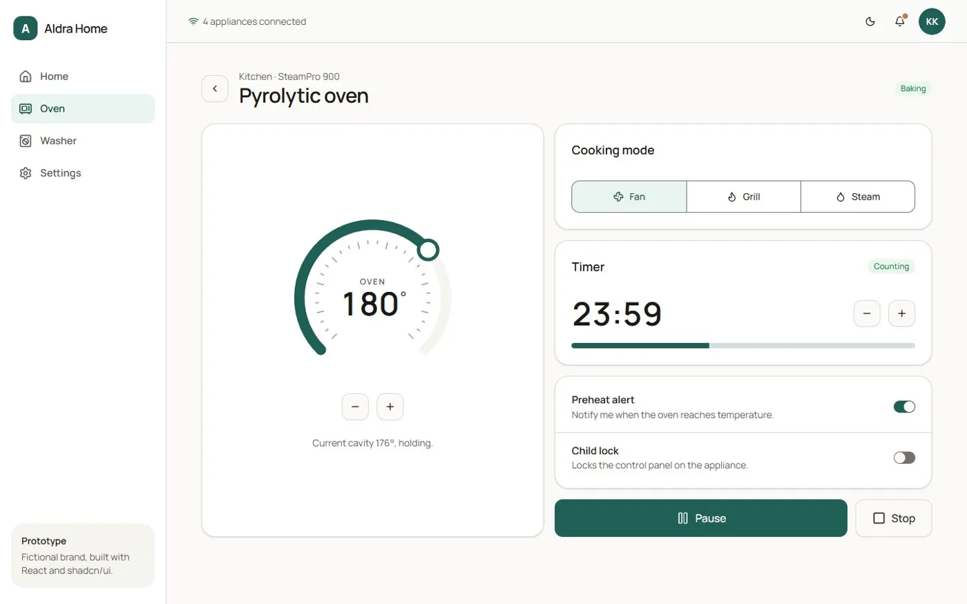
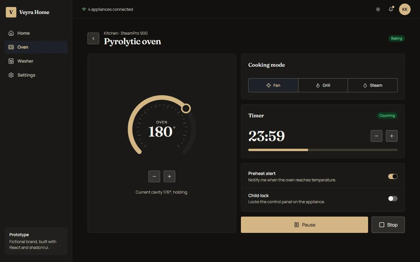
The same oven screen and the same React tree. Only the data-brand and data-theme attributes changed.
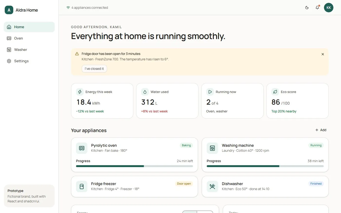
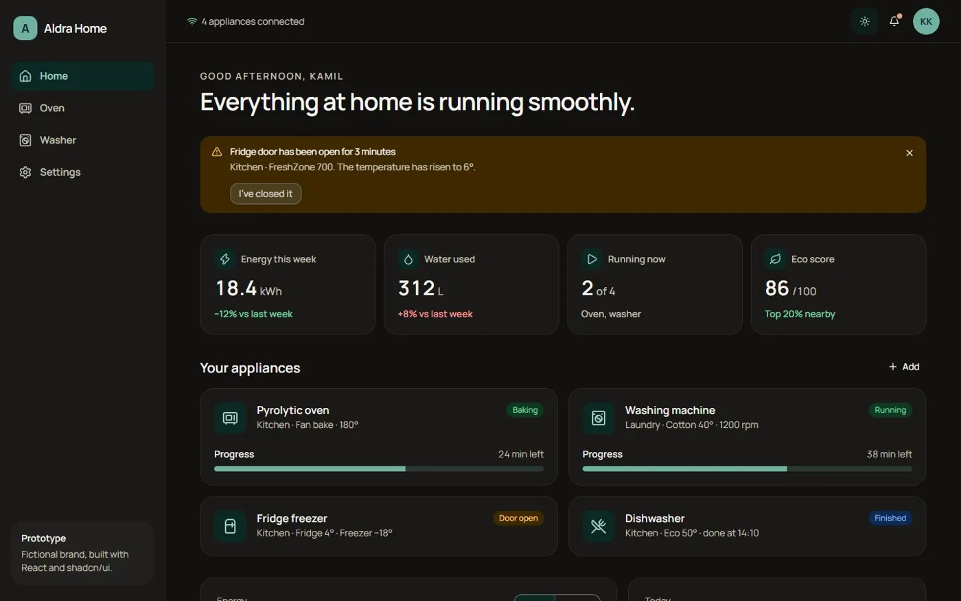
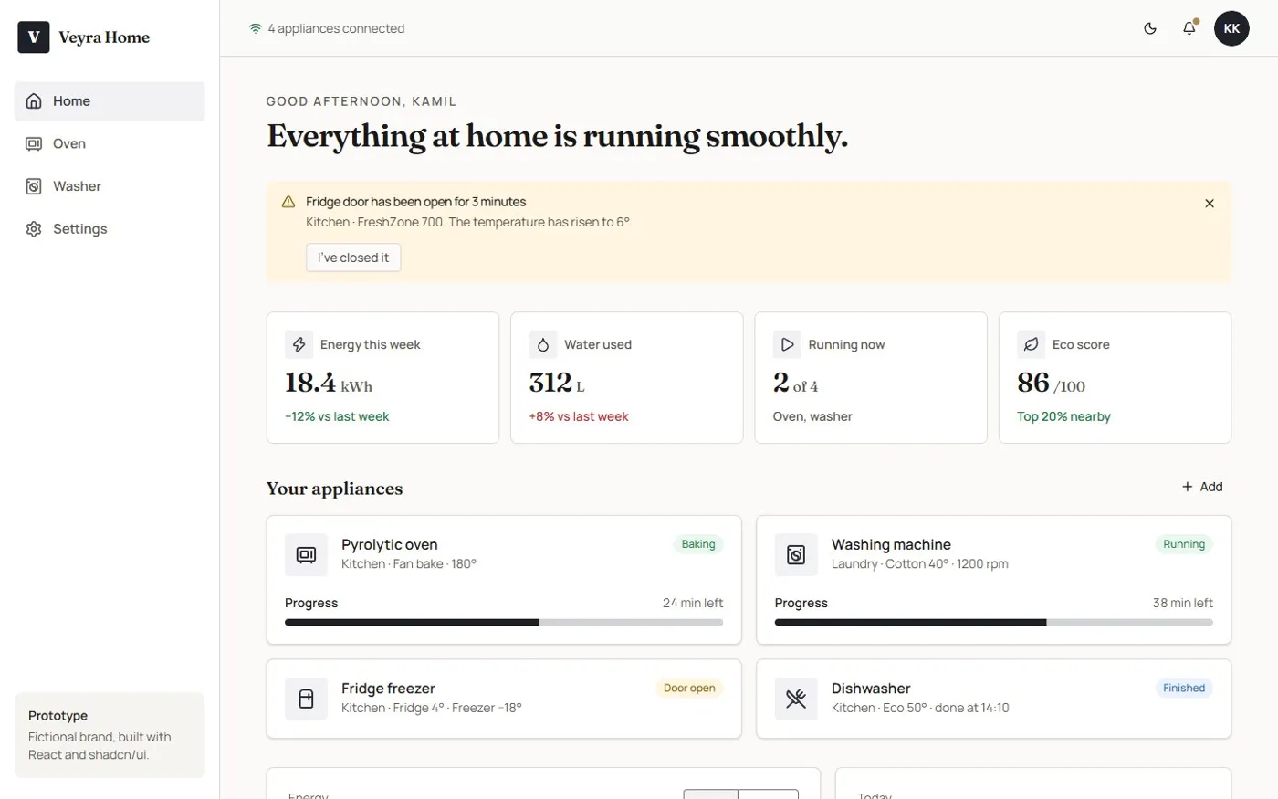
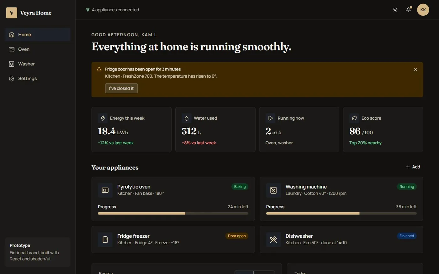
One component tree, four themes.
Three tiers, one build, zero runtime.
Tokens follow the W3C DTCG format in three tiers. Primitives are the raw palette and are never used by components directly. Semantic tokens map them to shadcn/ui’s roles (primary, card, muted-foreground) for light and dark. Brand tokens override only what makes a brand distinct.
Primitives
primitives.jsonpine.600pine.300clay.500ink.800brass.300neutral.50
Raw palette. Never used by components directly.
Semantic
semantic/light · dark.jsoncolor.primarycolor.cardcolor.muted-foregroundcolor.ring
shadcn/ui roles, defined once per colour mode.
Brand
brands/aldra · brands/veyra| Aldra | Veyra | |
|---|---|---|
primary · light | pine.600 | ink.800 |
primary · dark | pine.300 | brass.300 |
radius.item | 8px | 2px |
font.display | Manrope | Fraunces |
Only what makes a brand distinct.
[data-brand="veyra"][data-theme="dark"] {
  --primary: #d4b684;
  --brand-font-display: Fraunces, ui-serif, Georgia, serif;
  --brand-radius-item: 2px;
  /* …every semantic role */
}24 pairs × 2 brands × 2 modesAA or the build fails
Style Dictionary compiles every brand × mode into its own CSS block keyed on data attributes. Switching brand or theme is an attribute flip on the root element: no React re-render, no JavaScript theme object.
The same script then runs a WCAG 2.2 contrast audit over 24 foreground/background pairs in every brand and mode. That’s 96 checks on each build, and if any pair drops below AA the build fails. Accessibility becomes a build step instead of a review comment.
- 3
- token tiers
- 4
- themes: 2 brands × 2 modes
- 96
- contrast checks per build
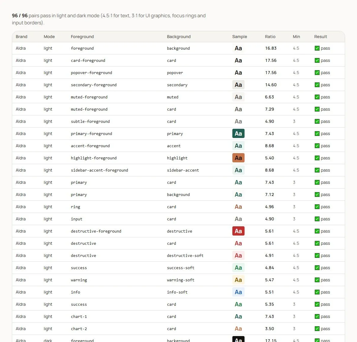
The contrast audit is also a Storybook page, so designers can see every ratio.
Where the kit stops, the system continues.
I started from shadcn/ui on Radix, so keyboard handling and ARIA come from well-tested primitives. I restyled 24 of its components purely through tokens. Where the kit had nothing for appliances, I built new pieces in the same style: token classes only, data-slot attributes, and a documented WAI-ARIA pattern.
- 01
Dial
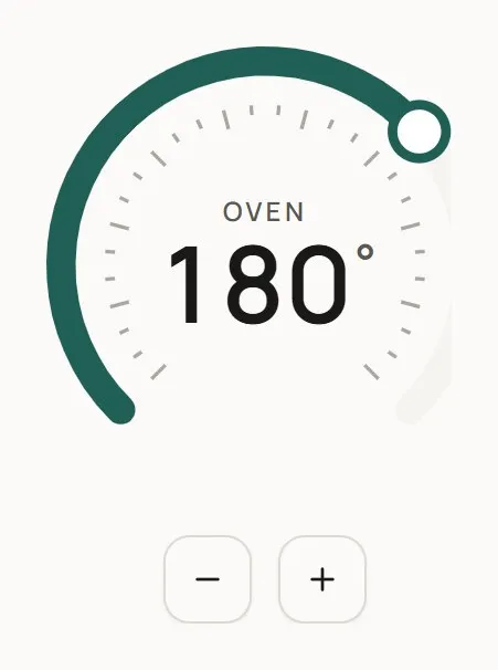
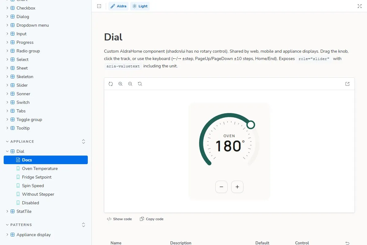
A rotary control for oven temperature, fridge setpoint and spin speed. It’s an SVG arc with a 270° sweep built on the WAI-ARIA slider pattern: arrow keys step, and −/+ buttons make it usable on touchscreens and appliance panels.
- 02
Stat tile
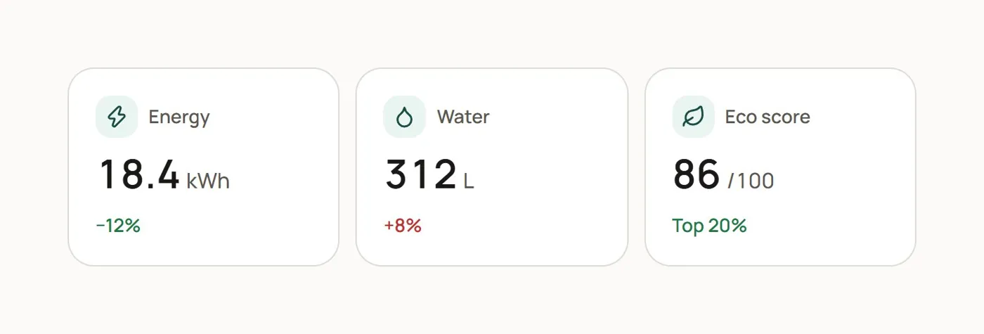
A KPI tile composed from the shadcn/ui Card: icon, value, unit and a week-on-week delta whose colour comes from success or destructive tokens.
- 03
Appliance display
An 800 × 480 oven panel pattern that proves the same components hold up outside the browser, at appliance scale and in dark mode.
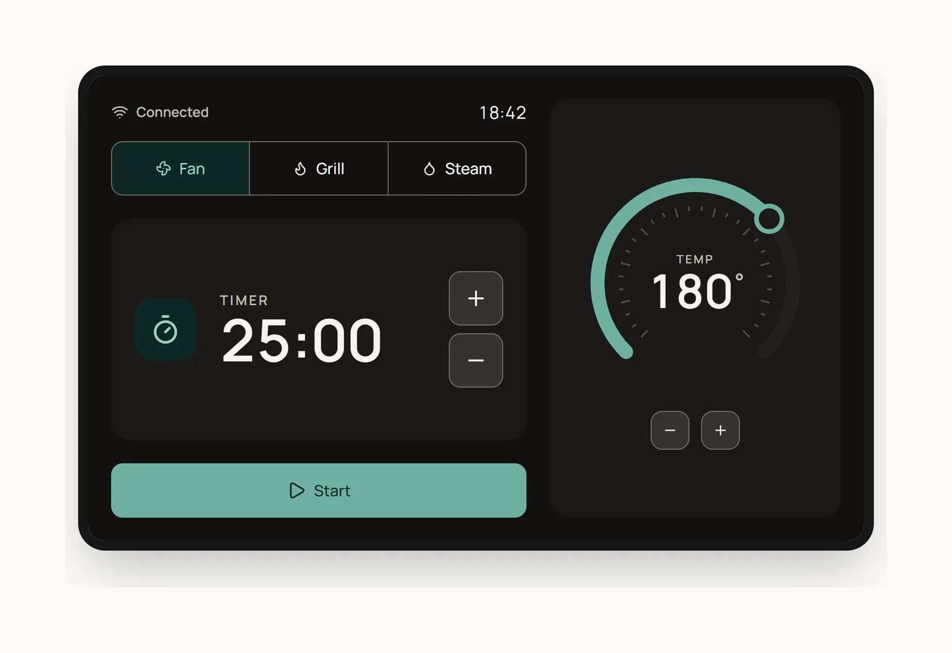
Appliance display pattern: the web components at the size of a real oven screen.
Proving the system in a real product.
A design system only proves itself in a product. Aldra Home is the portal where you check on your appliances and control them: a dashboard with live status, alerts and a weekly energy chart, plus dedicated screens for the oven and the washer.
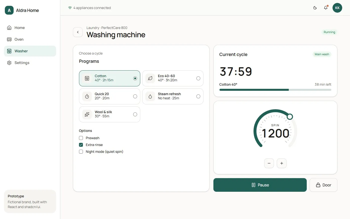
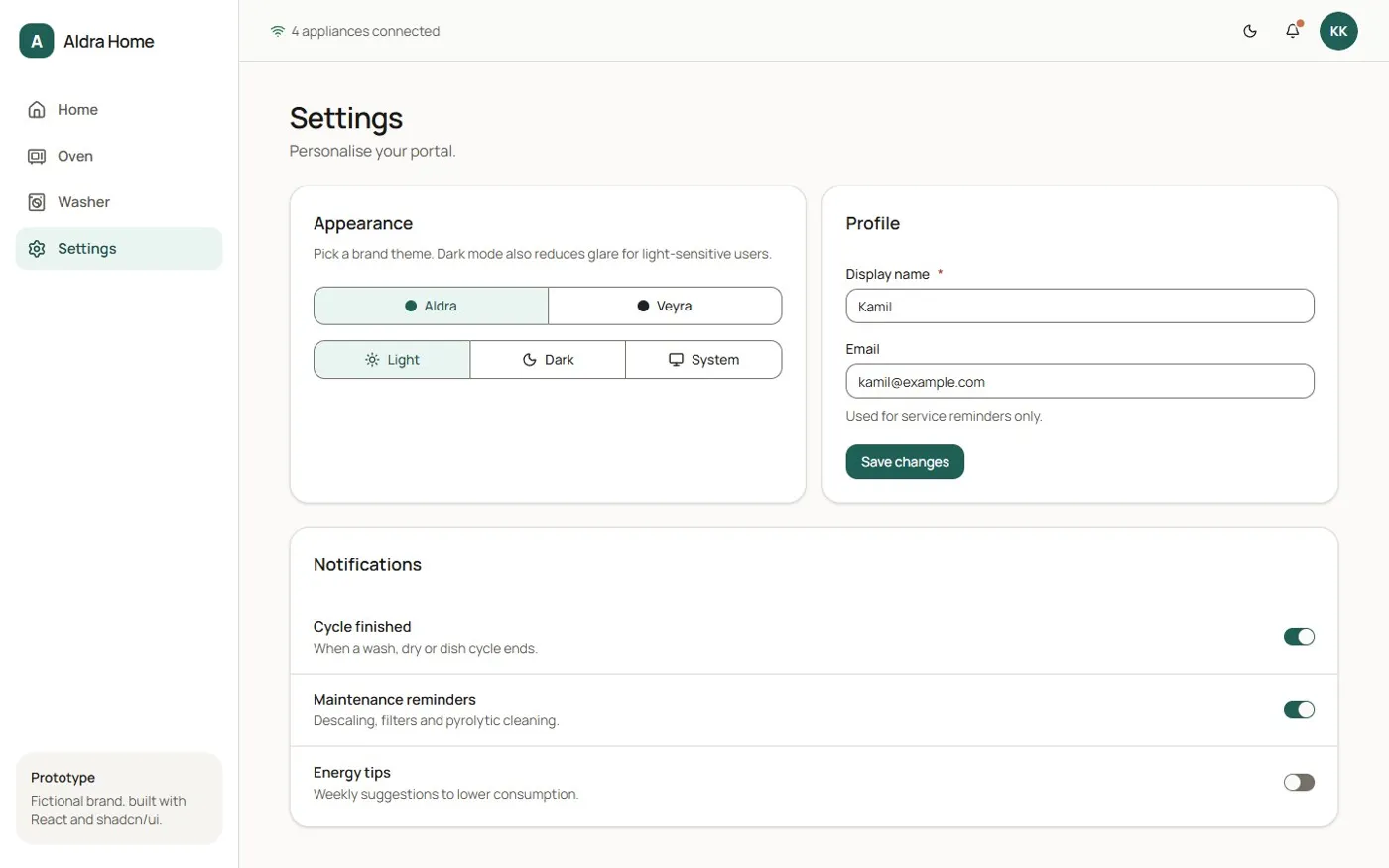
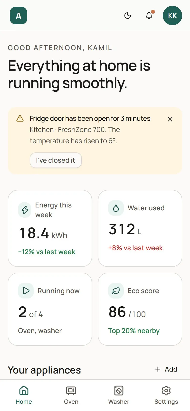
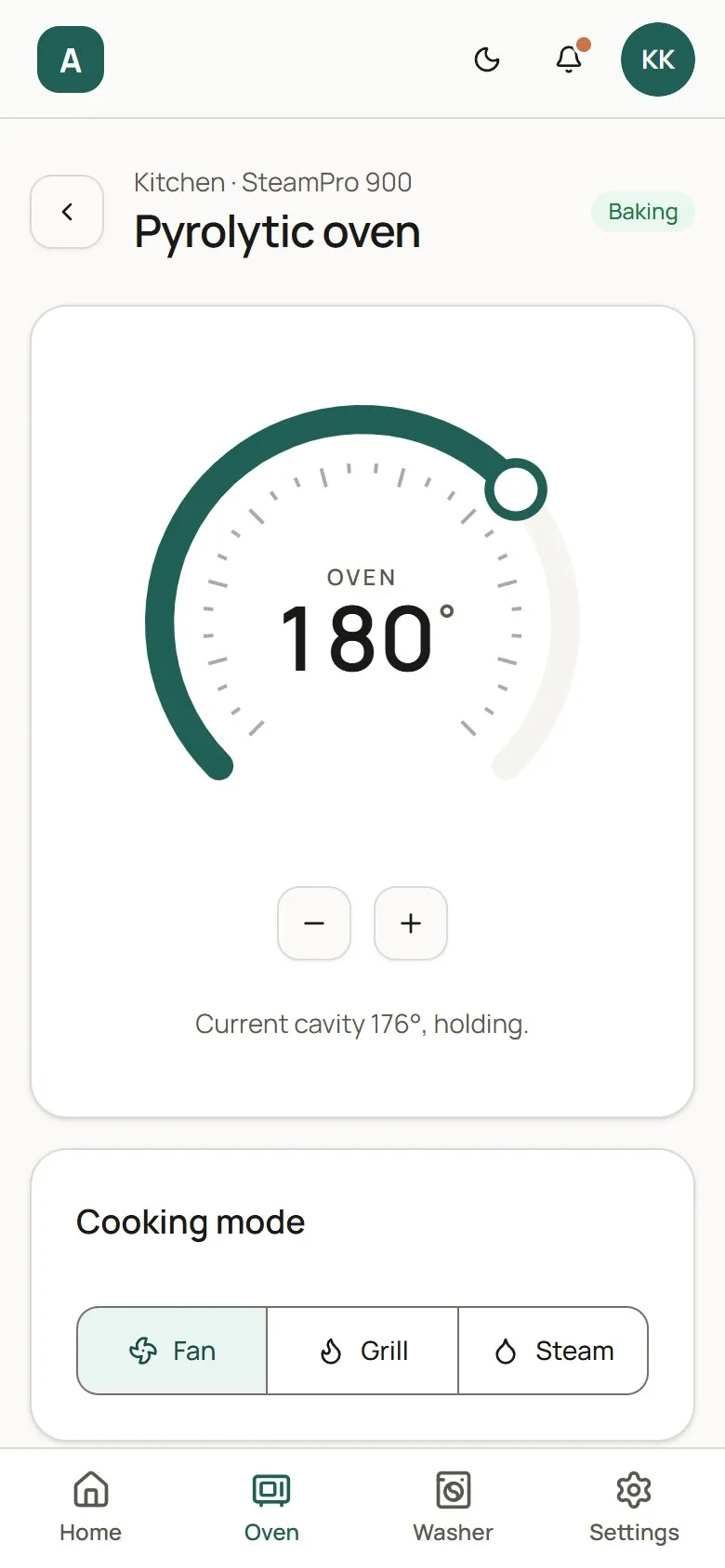
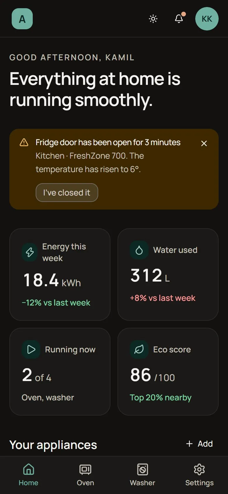
On mobile the sidebar becomes a bottom bar and the controls stay thumb-sized.
Accessible by default, fast with AI.
- 01
Contrast enforced at build time
The token pipeline refuses to ship a theme that fails WCAG AA.
- 02
axe in Storybook
The Storybook a11y addon runs axe on every story, so regressions show up while I’m building.
- 03
Keyboard first
A skip link, visible focus rings from the ring token, and ARIA patterns on every custom control.
- 04
AI in the workflow
Claude Code and Claude Cowork sped up the repetitive work: scaffolding stories, drafting the token pipeline and checking components against WCAG patterns. The design decisions and the final review were mine.
A system that grows by adding a folder.
- 26
- components in the system
- 2
- brands from one codebase
- 0
- runtime cost to switch theme
Adding Veyra as a second brand didn’t change a single UI component. It was three token files, a brand setter on the theme provider and a new option in Settings. That was the test I set at the start: a new brand should be a new folder, not a fork.
Next, I’d export the same tokens to Figma variables so designers and engineers share one source, and add token builds for native targets like SwiftUI, Jetpack Compose and Flutter to reach real appliance screens.